2015/6/16-8/19
The emphasis from the beginning is to solve the problems of standardization and color matching of the template and to seek for unity between schooling style and commercial needs. Obviously, the color of the picture on the left is bolder while that on the right is more conservative and traditional.  Interaction process It is mainly about thinking of how to simplify the process and simplify the interaction process. My idea is not to separate drag and upload, directly click on a button and then upload after pop up with the floating window. Perhaps, drag can be directly decided by the user, and delete button is better to be extracted.
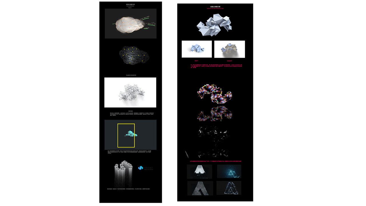
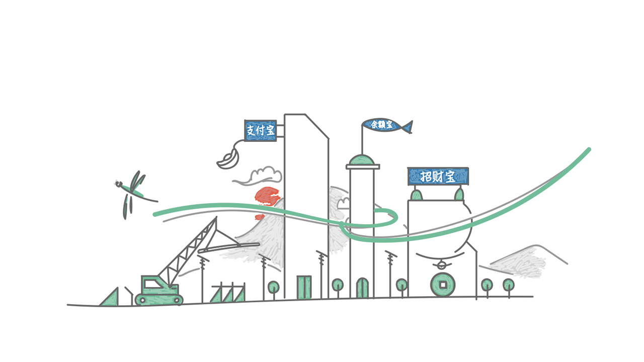
There will be a financial cloud installation at the entrance of the first floor in the new building, and I want to abstract the prototype of cloud to make creation.
Finally, our idea is to design the cloud as freely flowing style of calligraphy fonts with white structure, matching the rendering. At the bottom, we use dry landscape to render artistic conception, together with smoke installation to run through the whole model, so as to maximize the concept of freely flowing style.
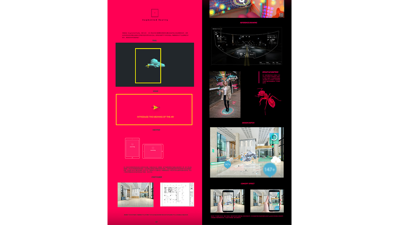
AR
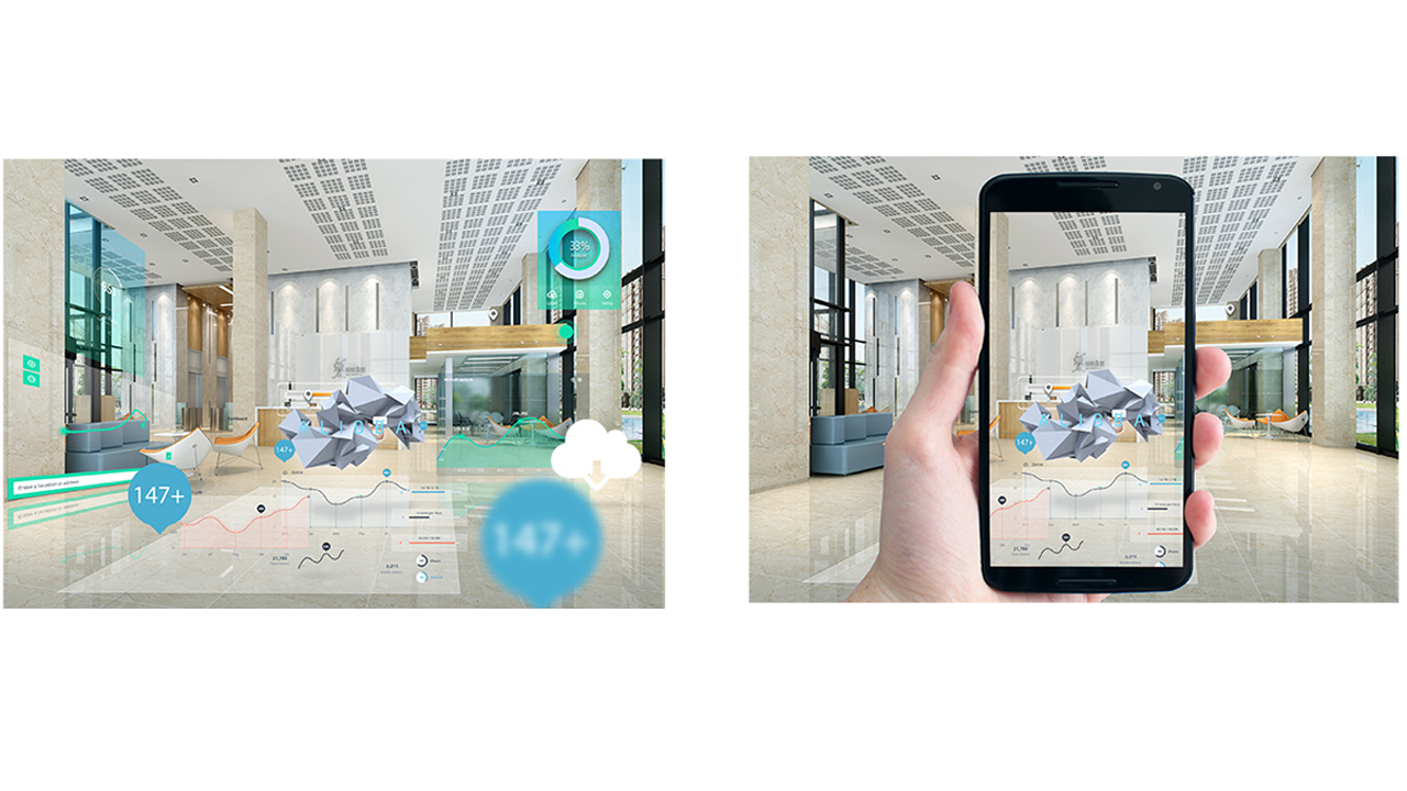
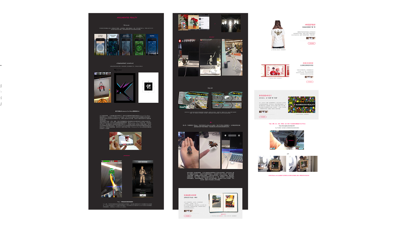
This program was derived from the time when I made the installation of the first floor in the new building, the essential content is to use the existing furnishings in the lobby of the first floor, to take these furnishings as the scanning spot, which will appear with a number of large data information and some internal applications after scanning, and to let new recruits download, etc.
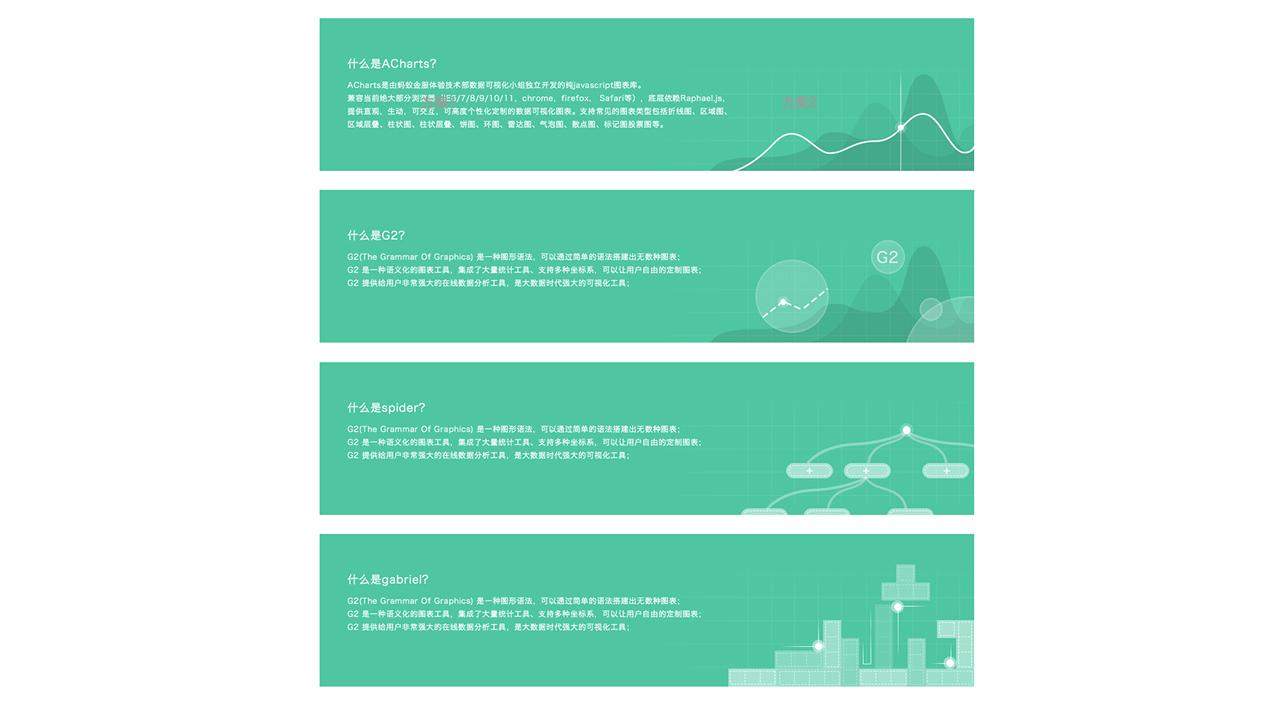
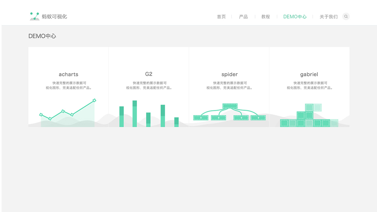
Each icon of the product should be closely combined with the characteristics of the product. Achars is to reflect the data and icons, and G2 wants to use a linear computer to reflect its editing ability. Spider and Gabriel is the representative of network data and tools respectively, thus it was designed accordingly.

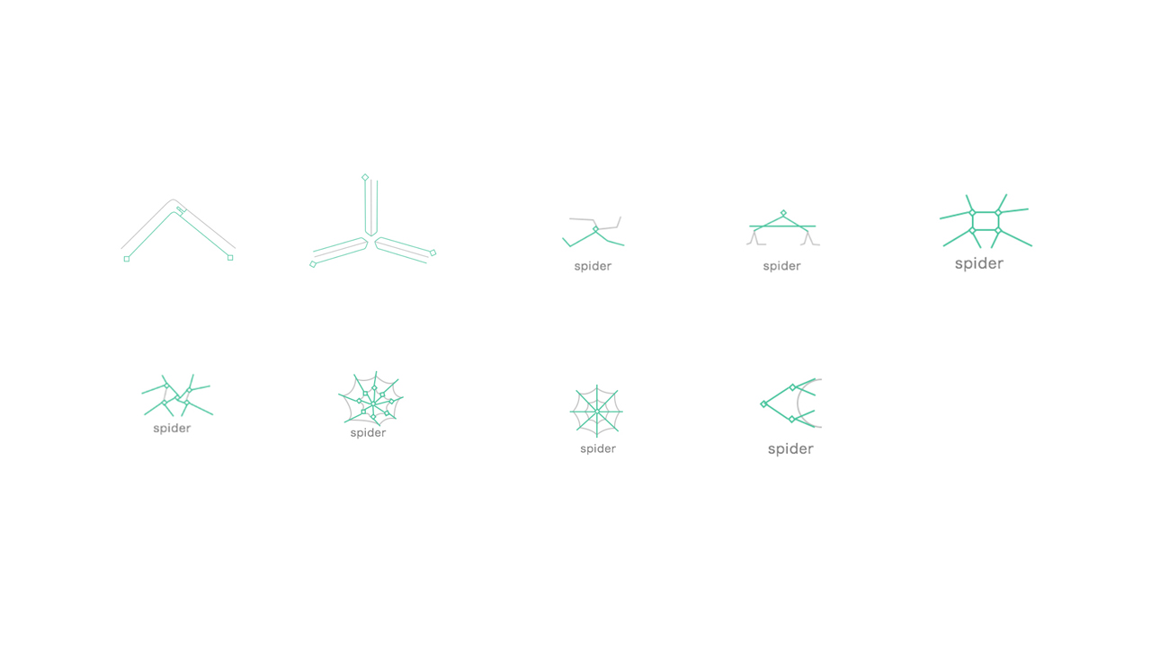
SPIDER DIFFERENT VERSION
ANT-V OTHERS PAGE
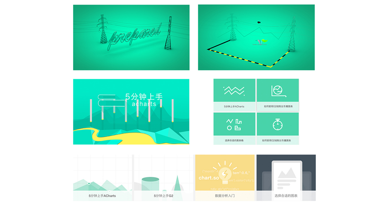
My design concept of project 1 and project 2 is the page under construction. My idea is to apply the means of zoosemy to perform on the page under construction. There will be telegraph pole at general construction site, and the yellow black line on the ground is generally used for eye-catching and presenting division of the area, thus it is used on the page of construction coursebook.
Project 3 is a coursebook page of achars designed, it transfers the line chart to the shape of mountain and uses histogram to performance telegraph pole, together with ground and brook to express a very natural a state.
Project 4 is the one simplified and the last is Project 5.
Some details: each icon should be consistent with the width of 1024px boundary when it is uploading to the Internet. Moreover, the thickness of large icon and small icon should be distinguished, etc.
How to interpret Gabriel? Simply speaking, it is a component, so I thought of the Russian box. Its concept is equivalent to components, of which each part needs to coordinate and nest.
Final version
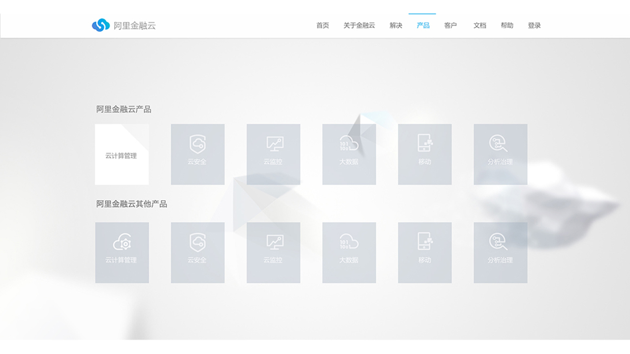
This is the beginning of the idea, because the product is divided into 6 parts and the visual of each part applies the abstract style of poly low in order to maintain unity, so the page is designed to parallax scrolling style. And these are two pages thereof, of which the upper part is for overall products, the underneath part is a separate introduction of sub products. However, this requirement is interrupted up to two products and the final designed requirement is due to the sustainability of the products being made. As there might appear a lot of products, so we have to make them to card style together with some tables.
This is the second version. In fact, there are a lot of versions not listed here. It meets the sustainability. Because the possibility of increase of hardware and software, it is designed to the card type.
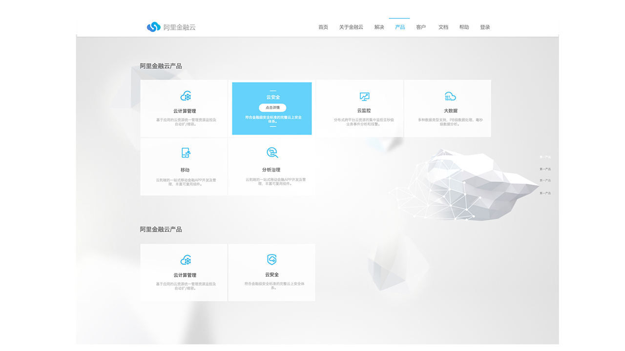
The finalized version is clearer overall. The number of card is reduced, and the color is regulated according to the whole standard page design of financial cloud. Grayscale fonts is maintained unity with two types and the background element is diluted, to keep a primary and secondary relationship.
Based on enhancing reality, we design a new intra-company App, and carried out a research. Firstly, it shows the product competitiveness analysis questionnaire survey. We have sent out 40 questionnaires for the staffs of the company, and received 25 copies of valid questionnaires. We have made some summary and analysis, and finally positioned the needs of this App in a system of scheduling meeting room.
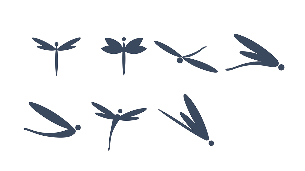
The aim of designing Dragonfly icon is pursuing light and fast, so there will be many versions with the direction of downside. The final solution applies the second version, and the reason is that the shape and saturation of the second version is smoother and completely filled.
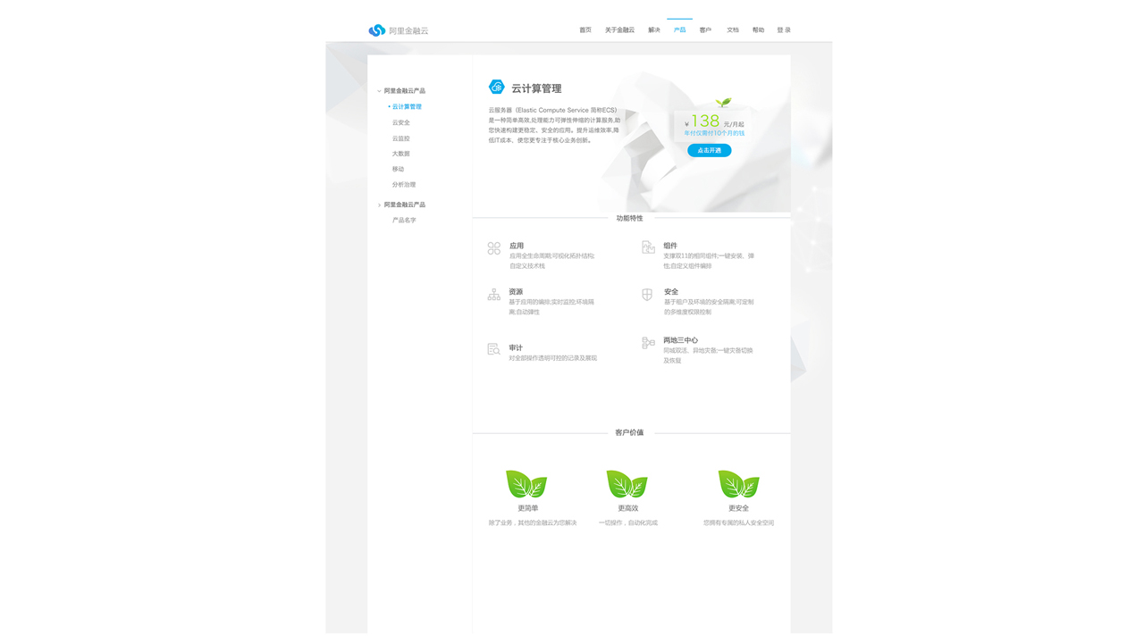
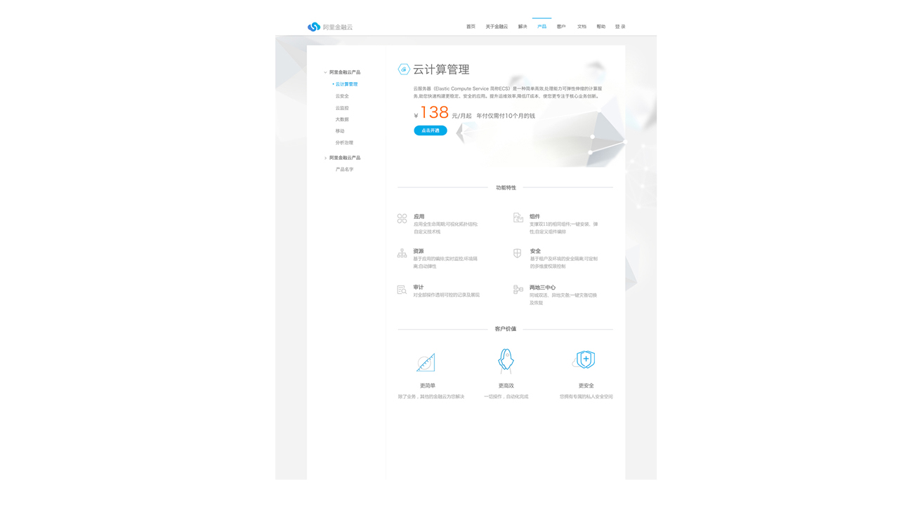
CLOUD COMPUTING MANAGEMENT
This is the first version of cloud computing management page, the banner area is mainly because the concept of cloud computing is equivalent to cooperation between the machine, so I design the picture area on the right side into the interlocking way, But as the first version is the first draft, some alignment and color bought which should be orange, etc. Some details haven't been taken into account.
The final version, the means of alignment has changed to aligning to the left alignment, the following three icons of customer value have changed to the means of overlap, as well as the way of hover has been changed.
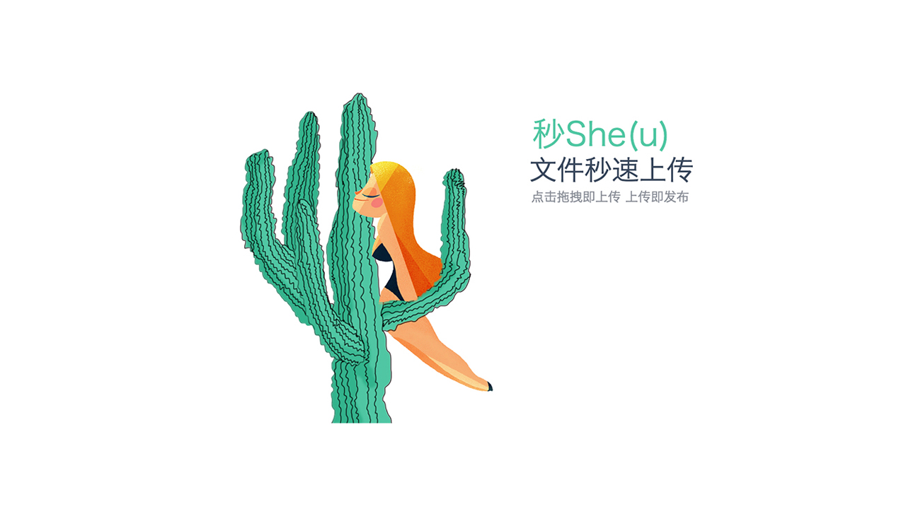
The fantasy of my design is a girl sitting on the cactus and eating, and the whole digestive system is used to describe the high efficiency and other functions of dragonfly. It seems a bit absurd, but it just uses this nonsensical illustration style to make daydreaming of people.
This is the final version. There is a rapid use of the function below each function.
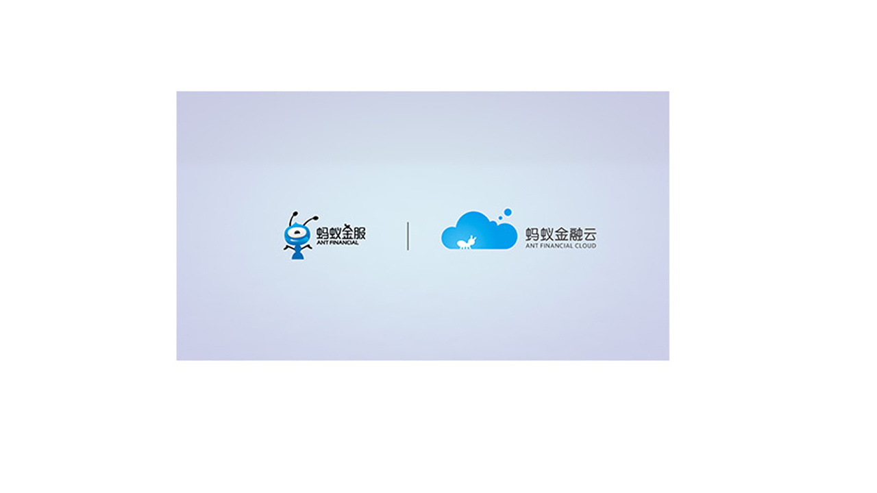
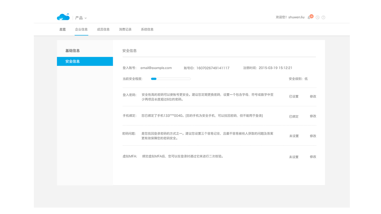
This is the security information page in the product of Ant financial cloud.
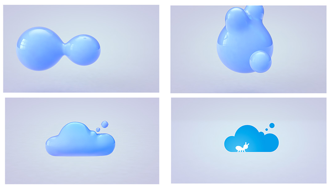
The animation storyboard time of Ant financial cloud is about 5 seconds in length, which shows from the integration of ball to a state of final converging into logo.
This is a design sketch of the first test of the effect on the ball.
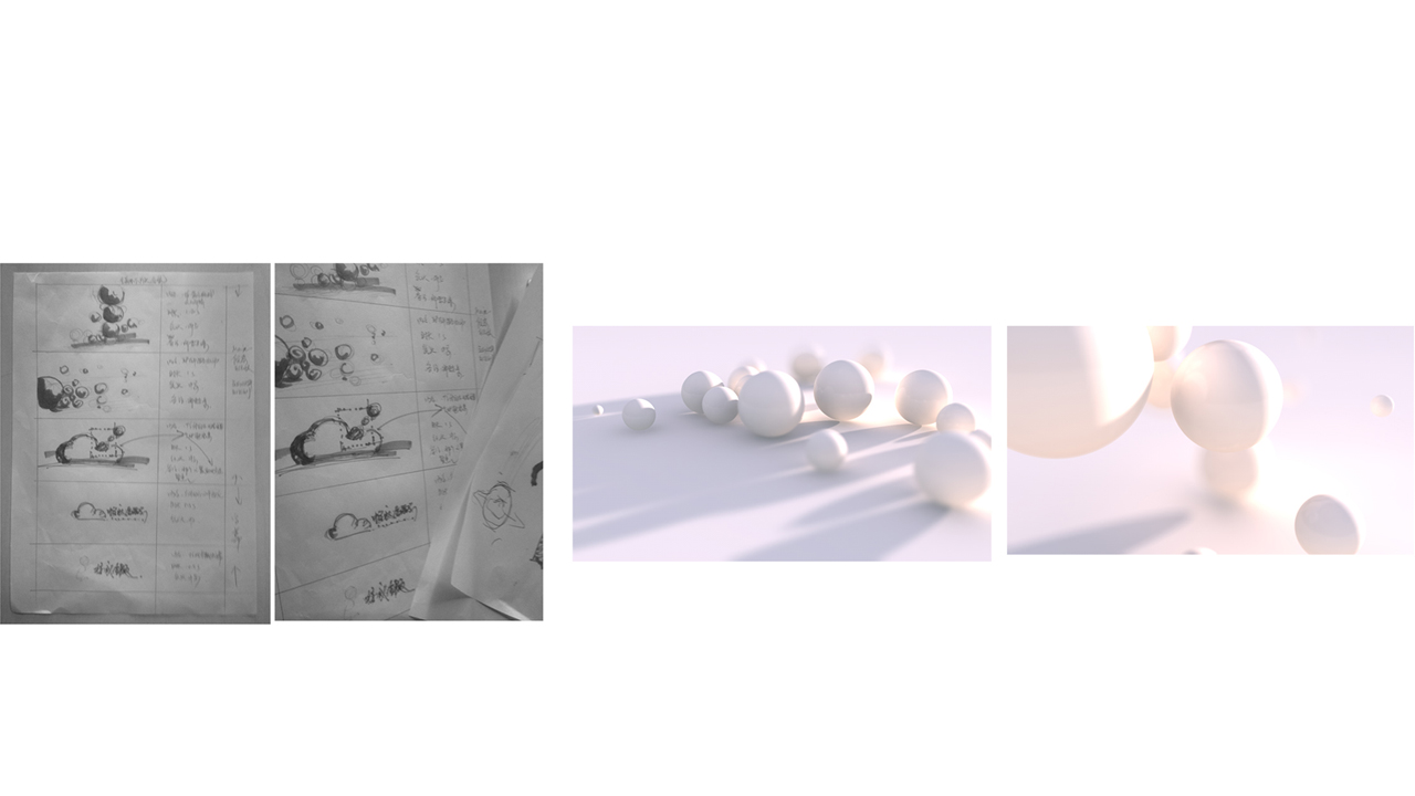
Finally, it is a design sketch of the integration of ball, of which there are a lot of changes in many places of its effect. For example, how to better change them without leaving traces in the middle of the lens, and some issues about the movement rate of some objects.