THE EXISTING PROBLEMS
It would be more intelligent to directly convert voice into text.
Remove the feature of game, and replace in this module the features of public homepage or public platform.
Place the like and comment features in the primary interface instead of the hidden position
Optimize chat log feature
It would be closer to young people’s thought with custom module, as there are just a few modules with clear tones in original wechat.
LITTLE-KNOWN FUNCTION
Current friend count: the number of friends in the contact could be counted in the pathway of Setting- General- Broadcast message by clicking Send now-New broadcast- Select all.
Independent password: the feature of “independent password” in the part of My account enables you to set a password specially for wechat.
Record your idea: the feature of “favorites” enables you to record your own voice, pictures in the camera application, geographic location etc. by clicking the "+" symbol.
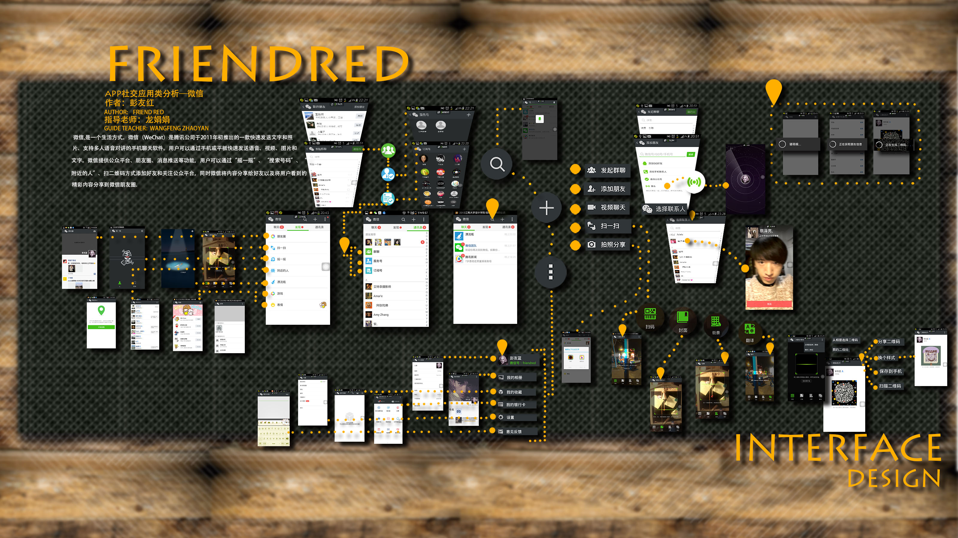
HIERARCHICAL RELATIONSHIP
ANALYSIS OF EMOTIONAL DESIGN
There is a book called "Emotional Design"
Based on the three different design dimensions of instinct, behavior and reflection, this book has used a unique, delicate, relaxed and satirical writing style to inllustrate the important status and role of emotion in the design as well as analyze in depth the way to integrate emotion with the product design.
I have tried to analyze the emotional design in the case of sound system which is seen from the Internet. The bedside sound system as an emotional design has a practical objective of brining users an excellent sensory experience with its lightweight materials and rounded shape, well combining functionality with aesthetics.
ICON
It has jumped out of the original icon design thinking. The surrounding object similar to seaweed is just like today's young people who are so inextricably linked with the sense of community that the buzz word could become popular in minutes among friends.

ENTEANCE INTERFACE
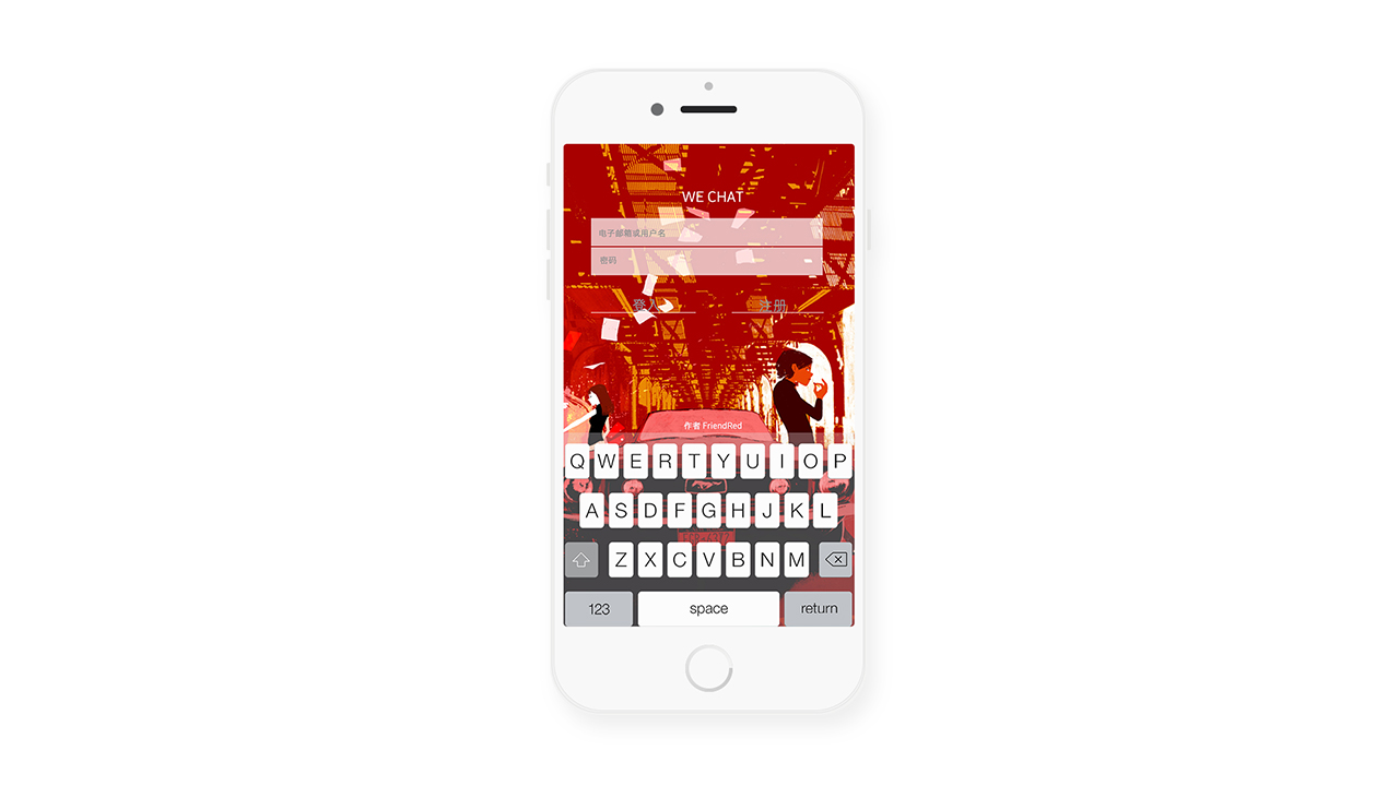
It’s better to change more audiences to young people, and design a lot of wechat versions for different groups of people.
Album access permission will be needed from the user in the entrance interface so that the big picture for the background could be set according to the user’s preferences.
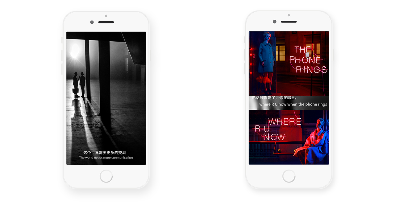
ENTER INTERFACE
This page will appear only when the app is downloaded for the first time, with the emergence of some words in conformity with young people’s thinking.
GUIDE INTERFACE
1.The function of public homepage will appear by sliding left.
2.To solve a few pain points, I have placed the favorite, like, history and search features below the main interface, preventing the cases of failing to find one’s own Chicken Soup in the list of favorites.
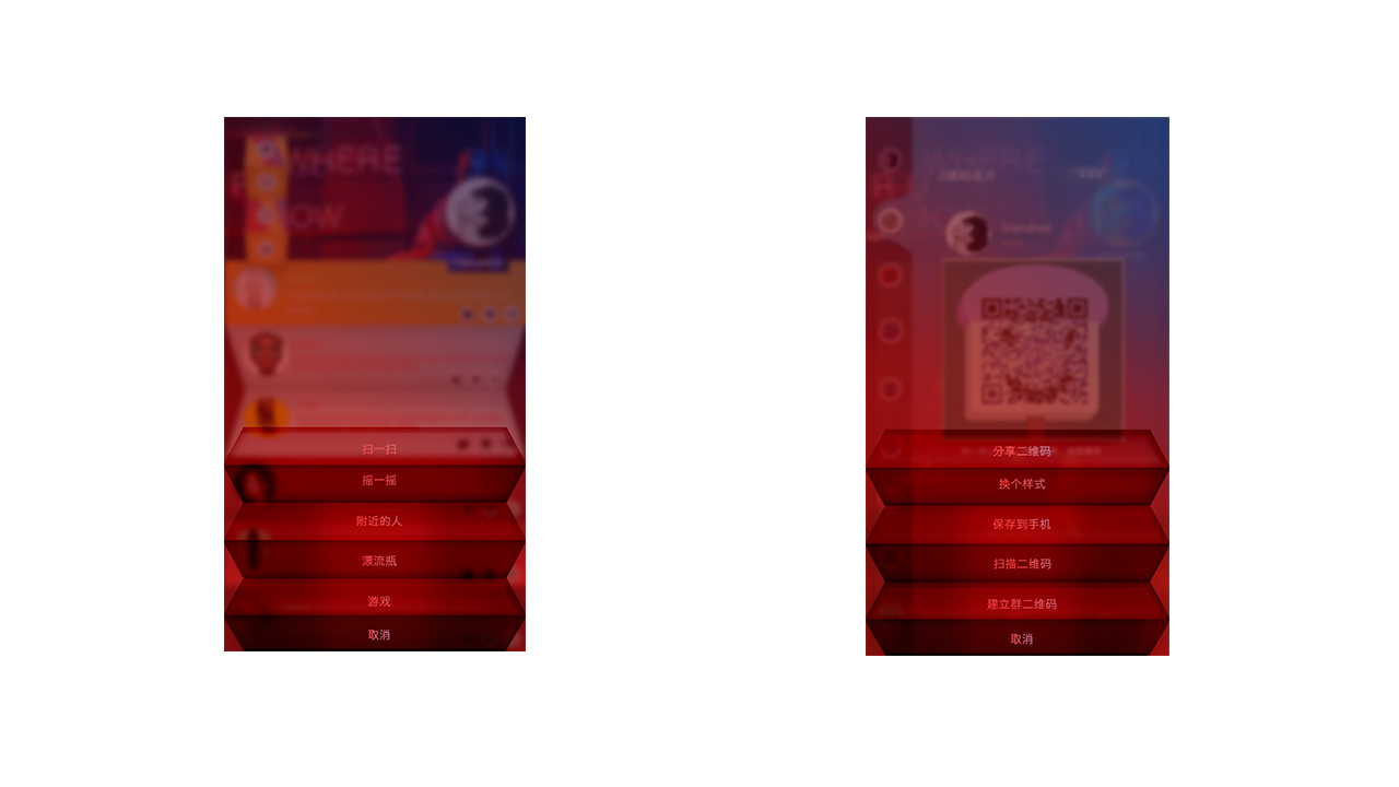
3.The function of scan QR code will appear by sliding right. The feature itself has not been changed too much, with the major change of its location with slide right.
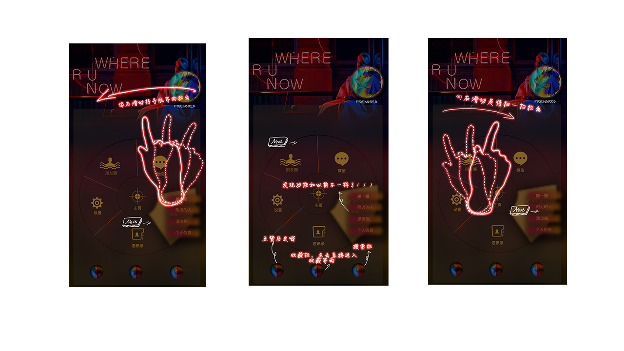
Slide right to show up scan QR code

THE TWO NEW FUNCTION IN THE CHAT PAGE
1. Switch between the group chat and single chat
2. Upload data to the cloud

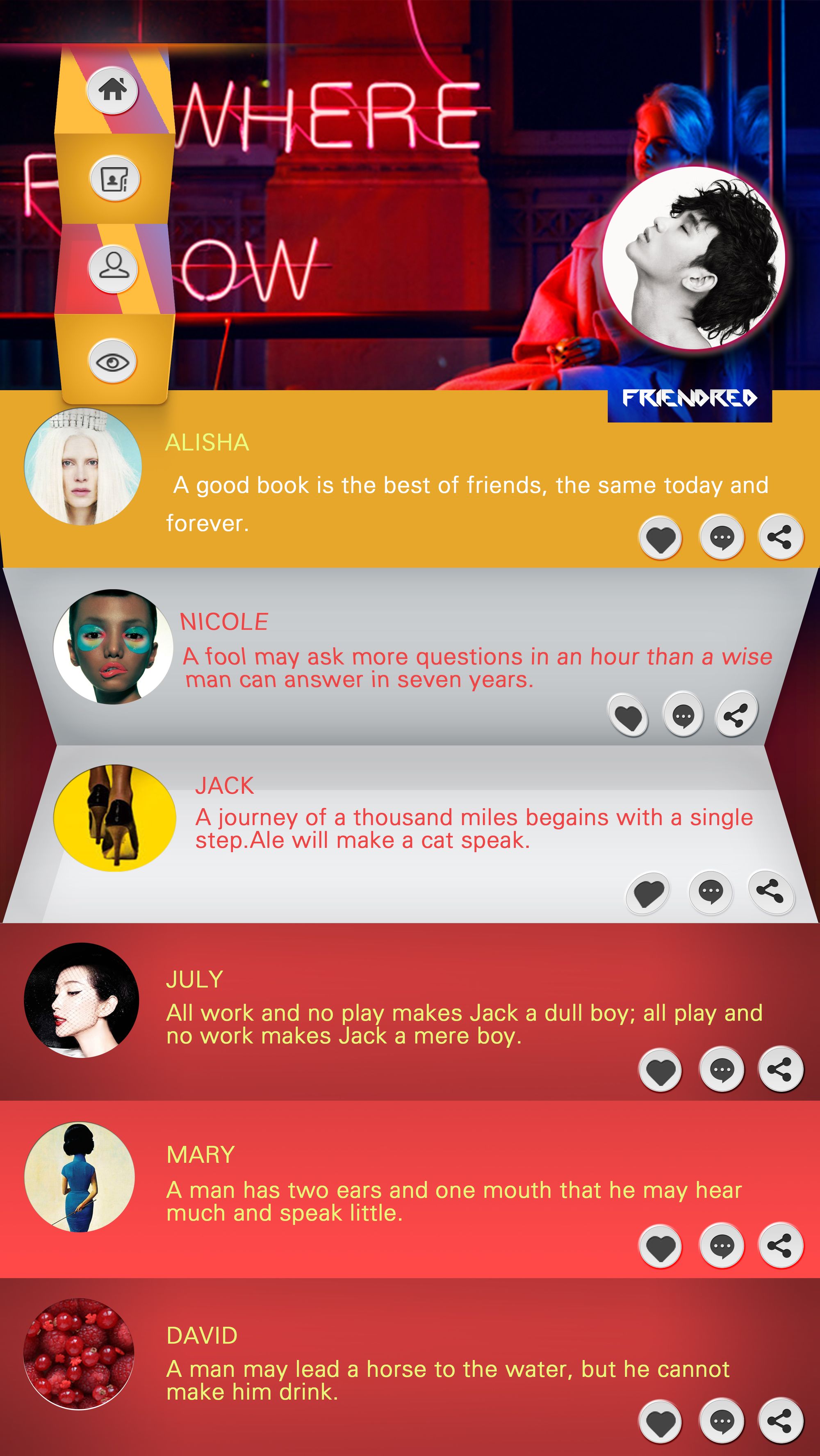
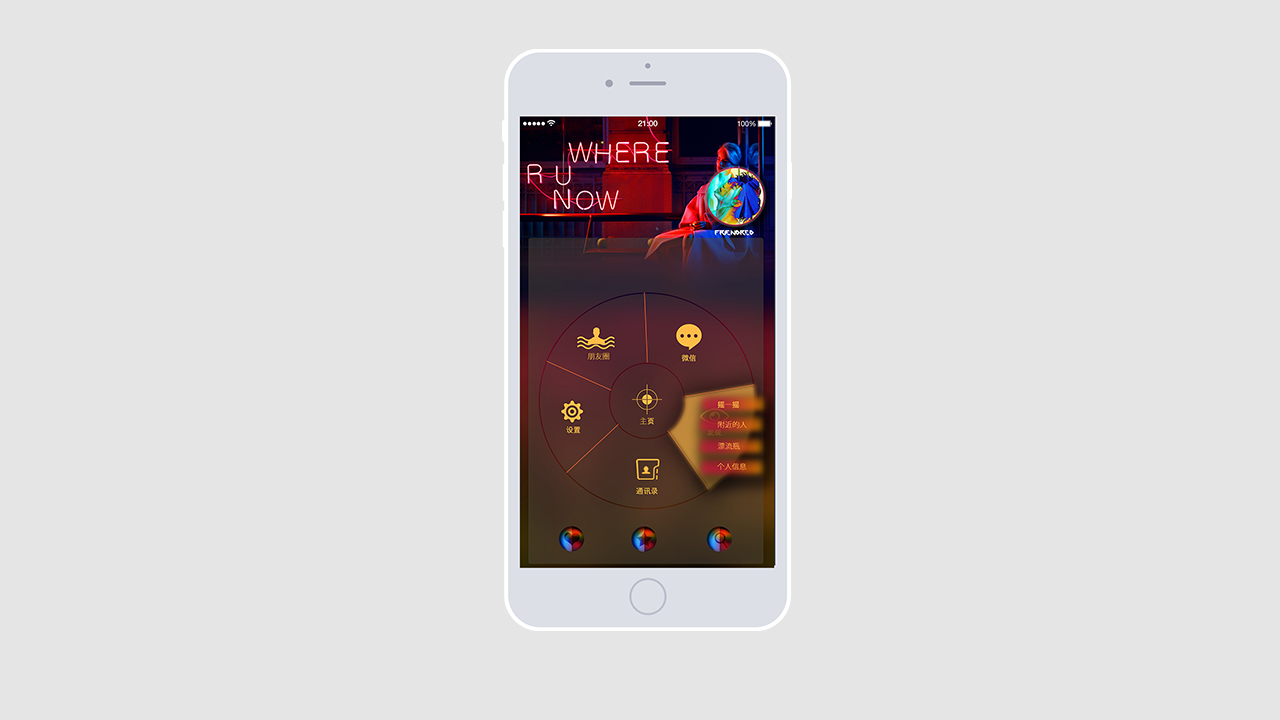
MAIN INTERFACE
It is noticeable in the design of the main interface that the previous elegant style has totally been changed into the feeling of personalized display and advanced customization.
Why the disc design is used?
It is for the simple reason that it will gather together as many commonly used features as possible. Four features will be placed in the secondary menu of the button, reducing the frequency of jumping and switching between pages.
Why the main screen looks so fancy?
In fact, it could be changed according to preferences. Similar to the profile in the feature of moment, all the pages in wechat will display the same style after your selection of one picture. People will find this kind of customization very simple as the style could be changed along with the change of one picture.
PERSONAL HOMEPAGE | CIRCLE OF FRIENDS
Why this foldable style is designed?
More information could be browsed in the moments and homepage with this foldable style. The picture is put inside the folding area by default and will pop up only when you would like to see it.
SINGLE CHAT | GROUP CHAT
The alteration of single chat and group chat aims to solve most users’ pain point that it is too complicated for people to search group chat by respectively clicking the address book and group chat.
The issue of data uploading issue has also been solved here simply through the feature of one-click upload.

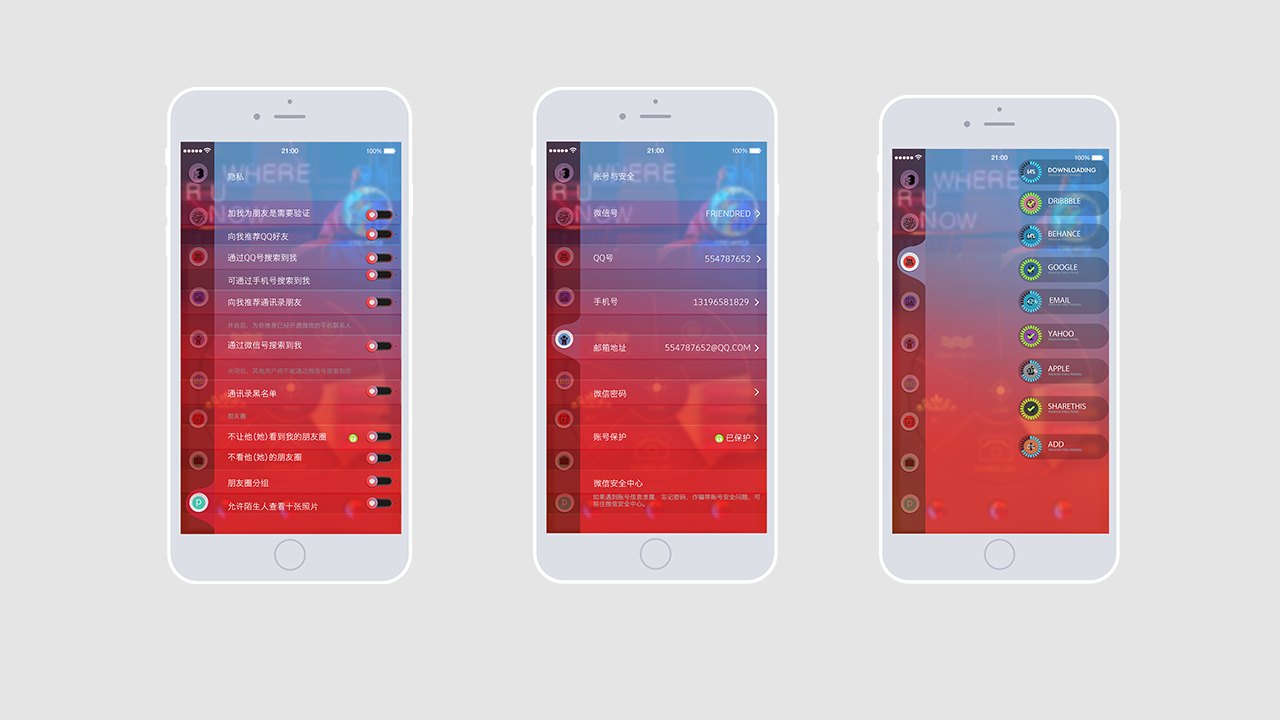
SET
There are few functional changes made in settings, with more changes with the interface and style. The adopted style of left menu bar will allow the user to see other features for easier search during setting change.
PRIVACY/ACCOUNT&SECURITY/SHARE
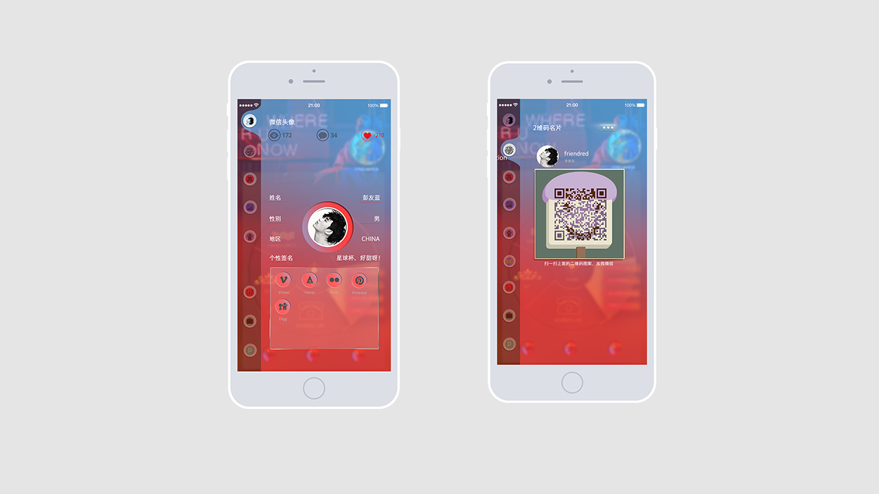
HEAD PORTRAIT/QR CODE
DROP-DOWN BAR
The drop-down bar locates in the upper left corner of the interface, appearing with slide and timely switching among homepage, contacts, chat and discovery. This kind of drop-down bar design aims to bring about a more smooth switch for users.

SHOTCUT BAR
Move some uncommonly used features into this module, as the user could find the feature after getting used to it.